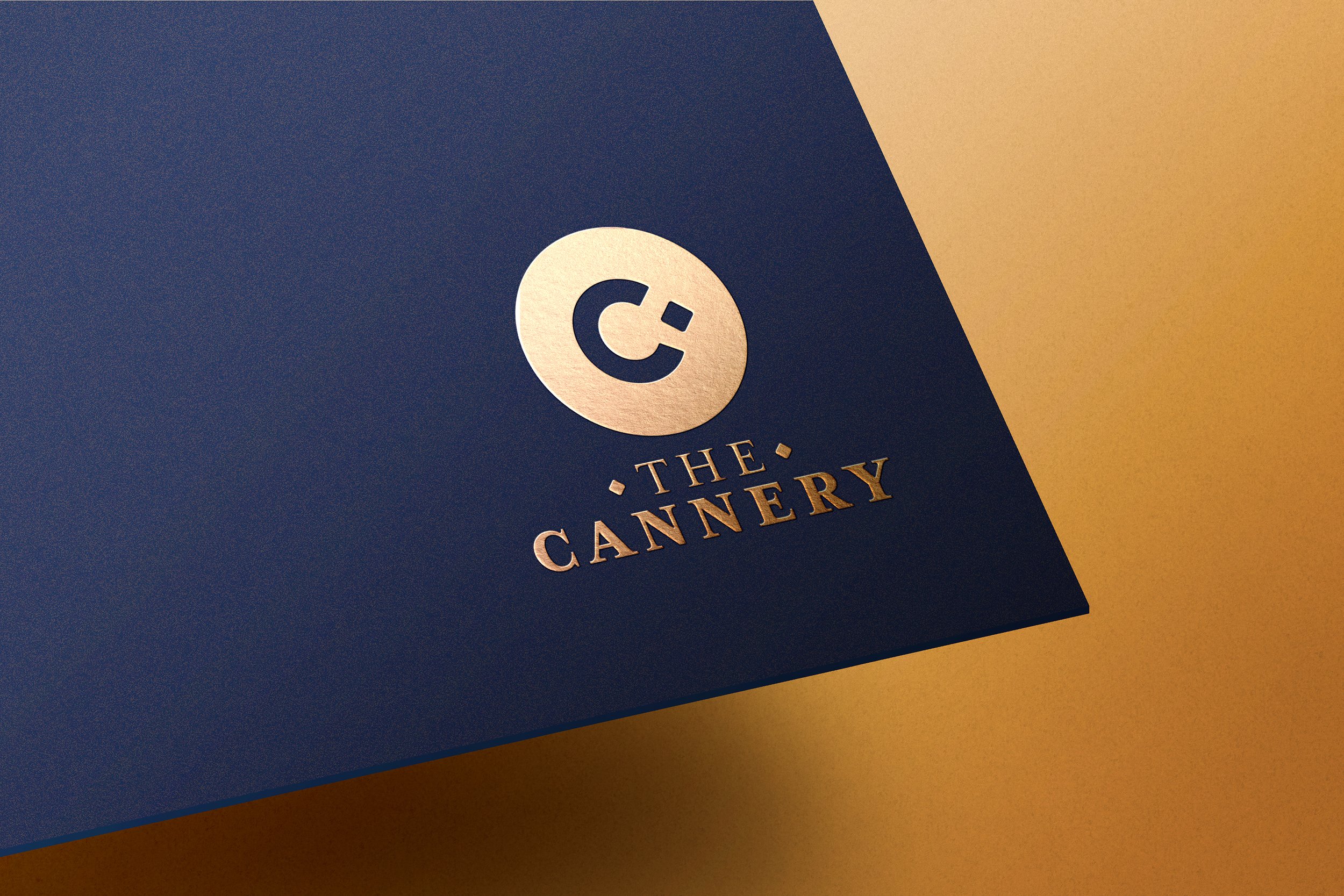
The entry point of branding.
Logo design is always the pinnacle of creative endeavors for me. Trying to distill a company, business or idea down to a single graphic or wordmark is a rewarding challenge. I’ve had the chance to do logo work for larger companies like Sony, but I’ve found my most enjoyable projects involve helping small businesses get a professional looking logo for a reasonable price given their size.
Flour City Flow.
Tasked with coming up with a new name and identity for a youth hockey team, I found a playful way to pay homage to the city of Rochester’s beginnings while also tapping in to hockey slang and the sports appreciation for a beautiful flowing mullet.


Sticks and Skates.
A Rochester-based skill development camp needed an identity. I created a logo that quickly highlighted the camps areas of specialty in hockey and lacrosse training for youth athletes.
Greenspace Parties.
A local event planning company that focuses on transforming outdoor spaces and hosting events in the great outdoors was looking for an identity. Together we worked through design options to land in a place that best spoke to the company’s founder.
DTB Lacrosse.
A Rochester-based youth lacrosse clinic focusing on fundamentals and developing skills in lacrosse was seeking an identity update. I adapted their original logo to bring a more polished feel to their clinic while also keeping their core element, a dingo.


